
Show me you Moves!
Hey there Pokéfans,
It looks like it has been quite some time since my last post, but fear not! While I am still crunching the number in order to solve our starter Pokémon mystery, I have also been hard at work on other projects. I hope that I can have something posted in a few new categories in the coming times. But for now, those projects are still developing.
However, the site was getting a little stale, so I decided to upload something new. This data was more of a companion piece to other things but I wanted to share it with you(the readers) as it is just another example of having fun exploring Pokémon data.
We all know about Pokémon moves. I mean, Pokémon battles without Pokémon moves is like professional wrestling without signature finishers. But how well do you know Pokemon moves? I took some time to dive into the movepool, and what I discovered was very interesting!!
The Dataset.
The dataset used for the exploration came to this website: https://pokemondb.net/move I webscrabed moves from here and then performed a bit of cleaning/management. If you want to use the dataset for your on analysis feel free to use it! You can download the dataset from my kaggle site: https://www.kaggle.com/supervegate/pokemon-moveset
Let Begin
Let’s start asking some questions about the move dataset! First, let’s start with something simple Questions
- What is the percentage of categories are represented in the entire movepool?
- What is the percentage of move types in the entire dataset?
After that, we are going to dig a little deeper by asking how to do our features “Category” and “Type” interact with one another. We will also use the Generation feature(“Gen”) in the dataset to look at the moves in a time-series sense.
- How do move categories differ depending on the type of move?
- How are moves added over the generations?
Finally, we will use the “Power” feature a point of analysis.
- What is the distribution of move “Power”? Does this differ depending on “Type” or “Category”
I want to take a small amount of time to briefly explain some of our features, just in case you stumbled upon this post and didn’t really have the necessary background knowledge(it’s okay, please keep reading!)
Type
Pokémon and their battle moves have something called “Type”. You can think of a type as a categorical designation that offers some advantages/disadvantages given a particular situation. In battle when a Pokémon attacks another Pokémon, the attacker’s move type interacts with the defending pokemon’s type
This relationship has three basic outcomes:
- The defending Pokémon’s type is Weak to the move’s type resulting in additional damage dealt.
- The defending Pokémon’s type is Neutral to the move’s type resulting in standard damage dealt.
- The defending Pokémon’s type is Strong to the move’s type resulting in reduced damage dealt.
- This interaction isn’t really important to this study but I discussed it in greater detail in my previous post*
Category
Pokémon moves fall into 4 distinct categories:
- Physical moves, which are related to a Pokémon’s Attack Stat
- Special moves, which are related to a Pokémon’s Special Attack Stat
- Status moves, which generally does something to alter the state of the pokemon, but doesn’t directly deal damage or relate to a particular Stat.
- Z-moves, which were recently introduced. The Pokémon must be holding a special item to get access to a high power finisher type move.
Again a bit more goes into this, but it isn’t needed to understand this EDA
EDA Analysis
Alright so let’s load up our necessary packages
# Load Packages
library(tidyverse) # Basically a staple in R Data Anaylsis
library(ggthemes)
head(All_Moves) # This is what I have the move dataset stored in
type_col <- c("olivedrab","coral4","darkorchid","gold","lightpink","firebrick4","orangered","lightskyblue","blueviolet","chartreuse3","lightgoldenrod","cadetblue1","grey","magenta4","deeppink","sandybrown","seashell4","steelblue2") # This is the color palette for the types. I tried to associate them with closely with the official colors the Pokémon game uses
Now we can start answering our questions! Our first question was:
- What is the percentage of categories are represented in the entire movepool?
Q1 <- All_Moves %>%
  count(Category) %>%
  mutate(Percentage =  n / sum(n) * 100) %>%
  mutate(Percentage_sig = sprintf("%0.2f", Percentage)) %>% # I added this after I made the Pie Chart. This will help the signifcant numbers from getting too wild.
  mutate(lab.yn = cumsum(n) - 0.5*n) # I added this after I made the Pie Chart. It coordinates the placements of the labels.
Q1
ggplot(data = Q1, aes(x = "", y = n, fill = Category))+
  geom_bar(stat = "identity")+
  coord_polar("y", start = 0)+
  geom_text(aes(y = lab.yn, label = Percentage_sig), color = "white")+
  scale_fill_brewer(palette = "Set1")+
  theme_bw()
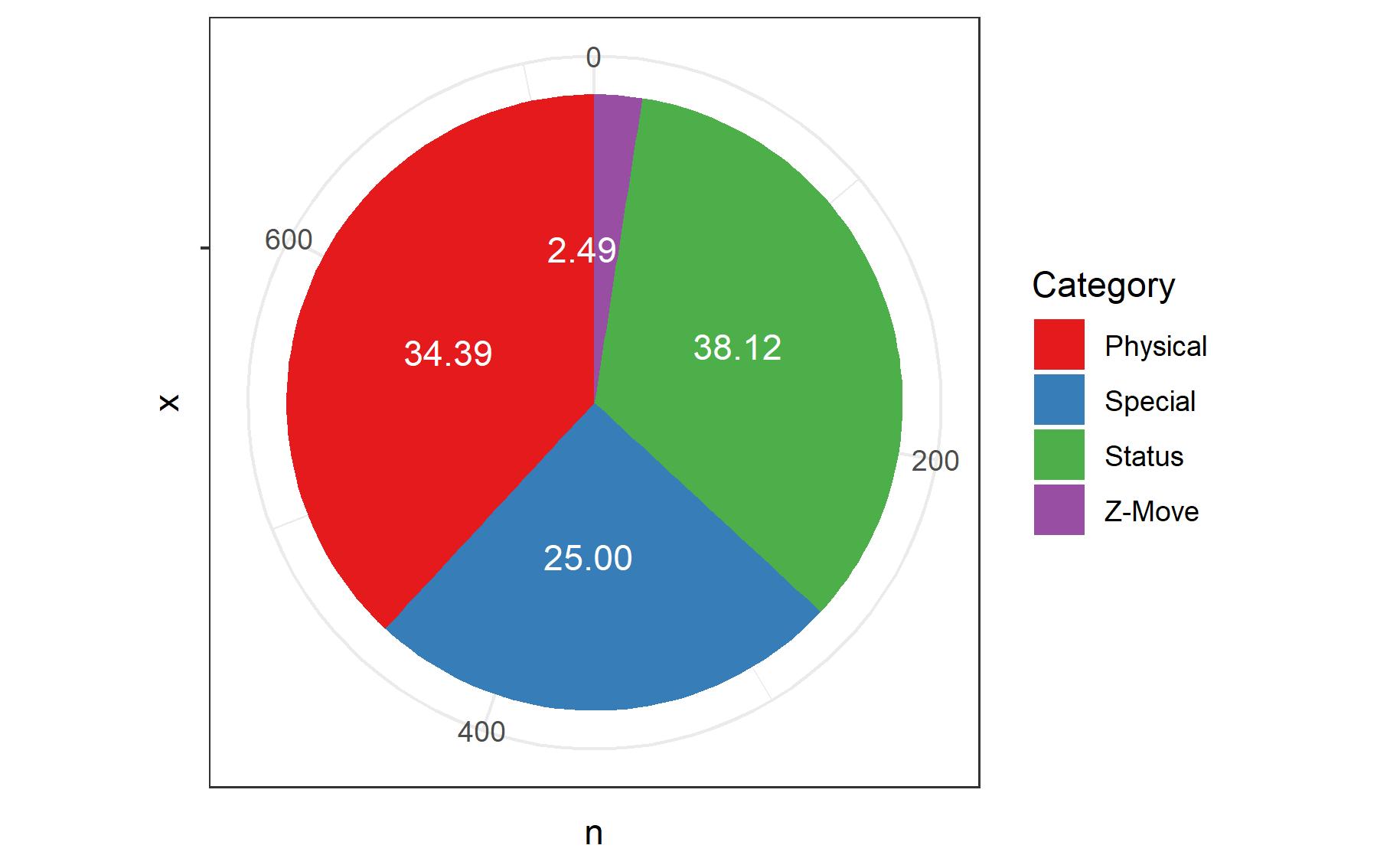
Honestly, I hate making Piecharts. I think they are more confusing than helpful and more trouble than they are worth. You can make a bar graph much easier, with more elegance, and with more digestible information.
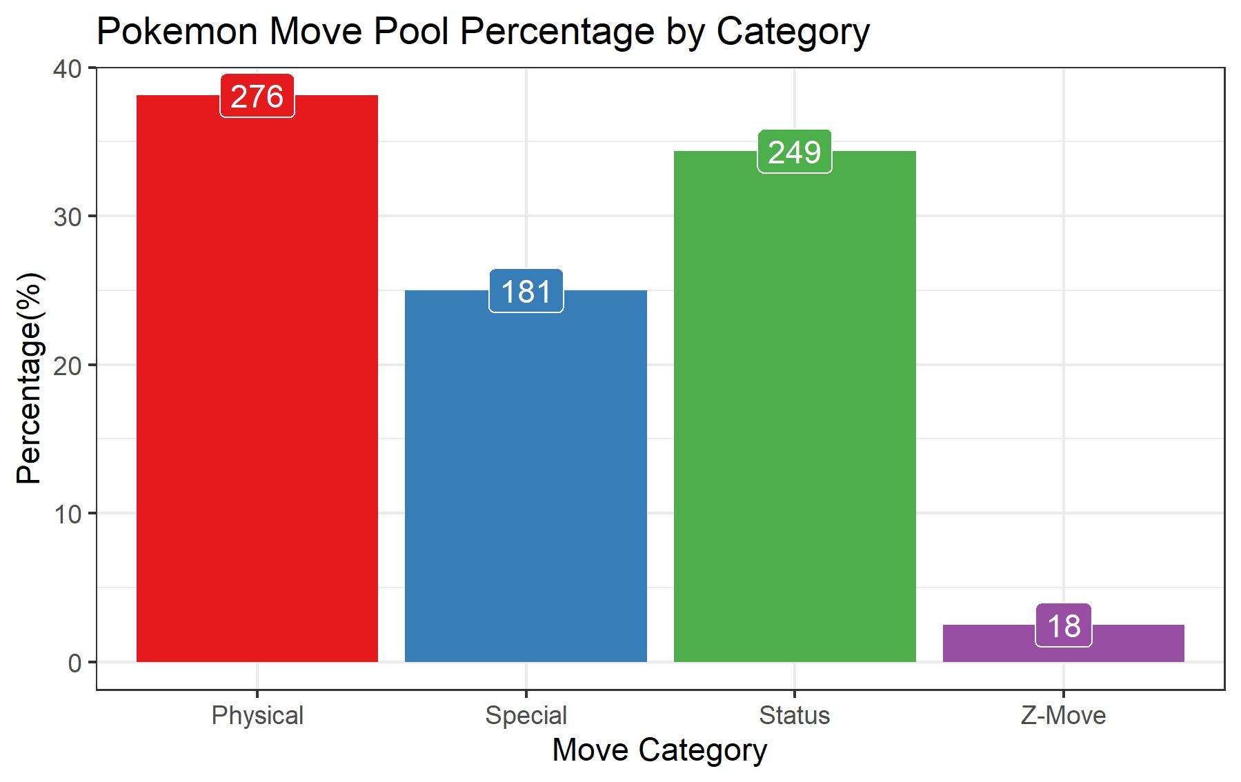
Q1.2 <- All_Moves %>%
  count(Category) %>%
  mutate(Percentage =  n / sum(n) * 100)
# This contains all the same numerical information with less code burdening
Q1.2
ggplot(data = Q1.2, aes(x = Category, y = Percentage, fill = Category))+
  geom_bar(stat = "identity")+
  geom_label(aes(label = n),position = position_dodge(width = 0.9), color = "white")+
  guides(fill = FALSE)+
  labs(x = "Move Category", y = "Percentage(%)", title = "Pokemon Move Pool Percentage by Category")+
  scale_fill_brewer(palette = "Set1")+
  theme_bw()
Luckily for us, our second question is pretty similar to our first. Here we are just looking at move type as opposed to a category so most of our code will stay the same For refreshers, our second question was this:
- What is the percentage of move types in the entire dataset?
Q2<- All_Moves %>%
  count(Type) %>%
  mutate(Percentage =  n / sum(n) * 100) %>%
  arrange(Percentage)
Q2
ggplot(data = Q2, aes(x = Type, y = Percentage, fill = Type))+
  geom_bar(stat = "identity")+
  scale_fill_manual(values = type_col)+
  geom_label(aes(label = n),vjust = 1.2,position = position_dodge(width = 0.4), color = "white")+
  guides(fill = FALSE)+
  labs(x = "Pokemon Type", y = "Percentage(%)", title = "Pokemon Move Pool Percentage by Type")+
  theme_bw()+
  ggsave("MovePoolByType.jpeg", width = 10, height = 6)
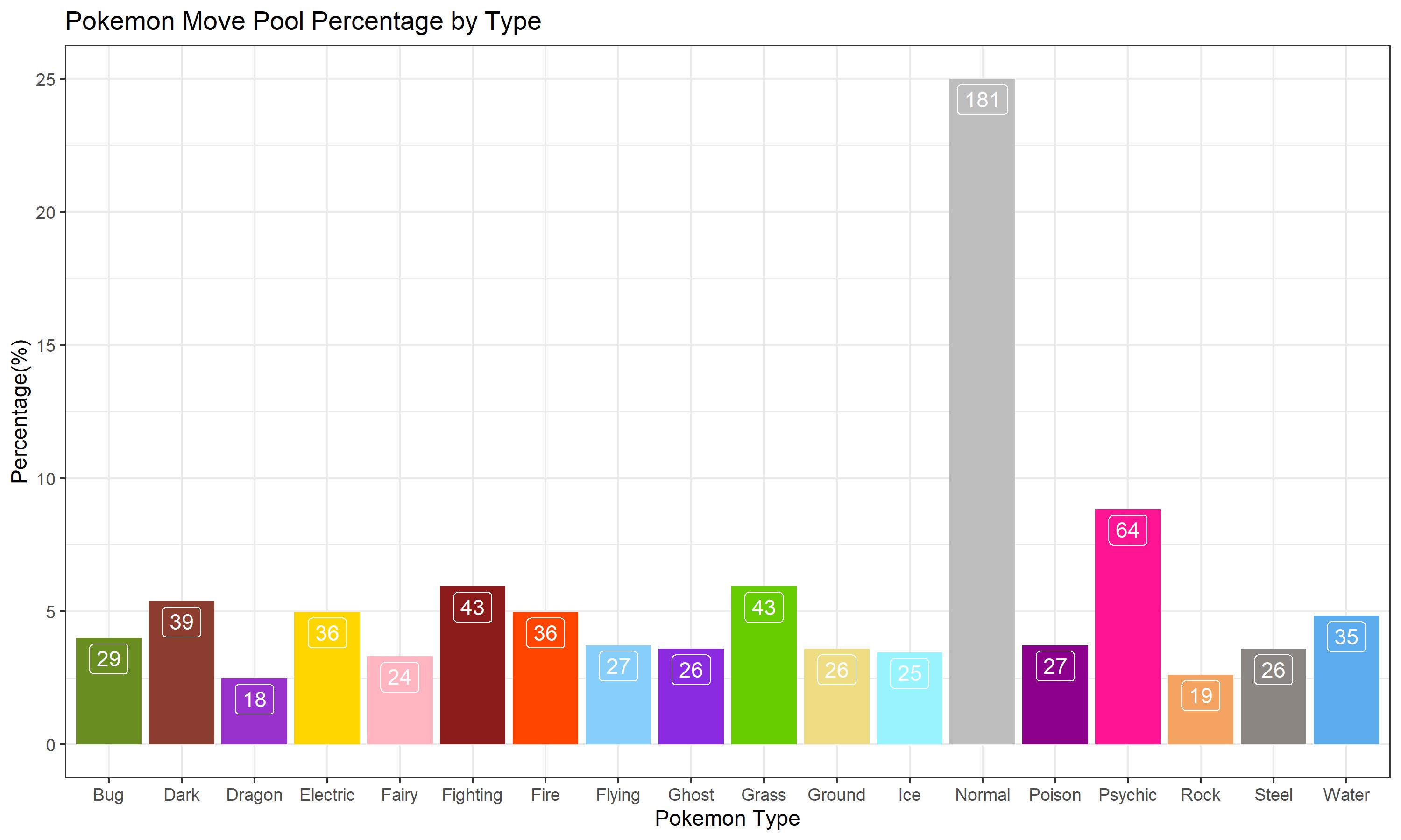
Although we are asking about percentages, I thought it would be worthwhile to add the actual numbers, just so we can get a real feel on how the graph represents the data. Here we can see that normal types make up the vast majority of move types. Normal-type moves make up about 25% of the entire movepool. While this might not sound like much, I think it’s worth noting that the move types consist of 18 different types. While I did expect normal to be the majority, I didn’t think it would be this overwhelming.
The second place goes to Psychic which surprised me a bit. Some of the actual psychic moves are a bit unintuitive to their type, like the psychic type move “Agility”. Grass and Fighting tie for third.
What surprises me most is the fact that Dark is the 5th most populated move type. This surprises me because the Dark-type was introduced in the second generation. There are more Fairy type moves than Dragon type moves. Although this should be even more surprising, given the fact that the Fairy type has only been around for 2 generations. However, the reasons behind this make a bit of sense, even if our dataset cant capture it. Mostly because:
- A lot of normal type moves and Pokémon were converted into Fairy type once the type was created
- In the game mythos, Dragon types have the motif of being strong, rare, and powerful. So it would make sense that their moves would be somewhat limited.
This also has a few more underlying consequences. First, it means that Normal-type moves could have potentially dominated even more of the movepool. It also means Rock types got shafted pretty hard. They have been around since the very beginning and have considerably less moves than any other type.
- How do Move Categories vary by Move Type?
Okay and now combined the two graphs. I want to see how the move categories vary by type.
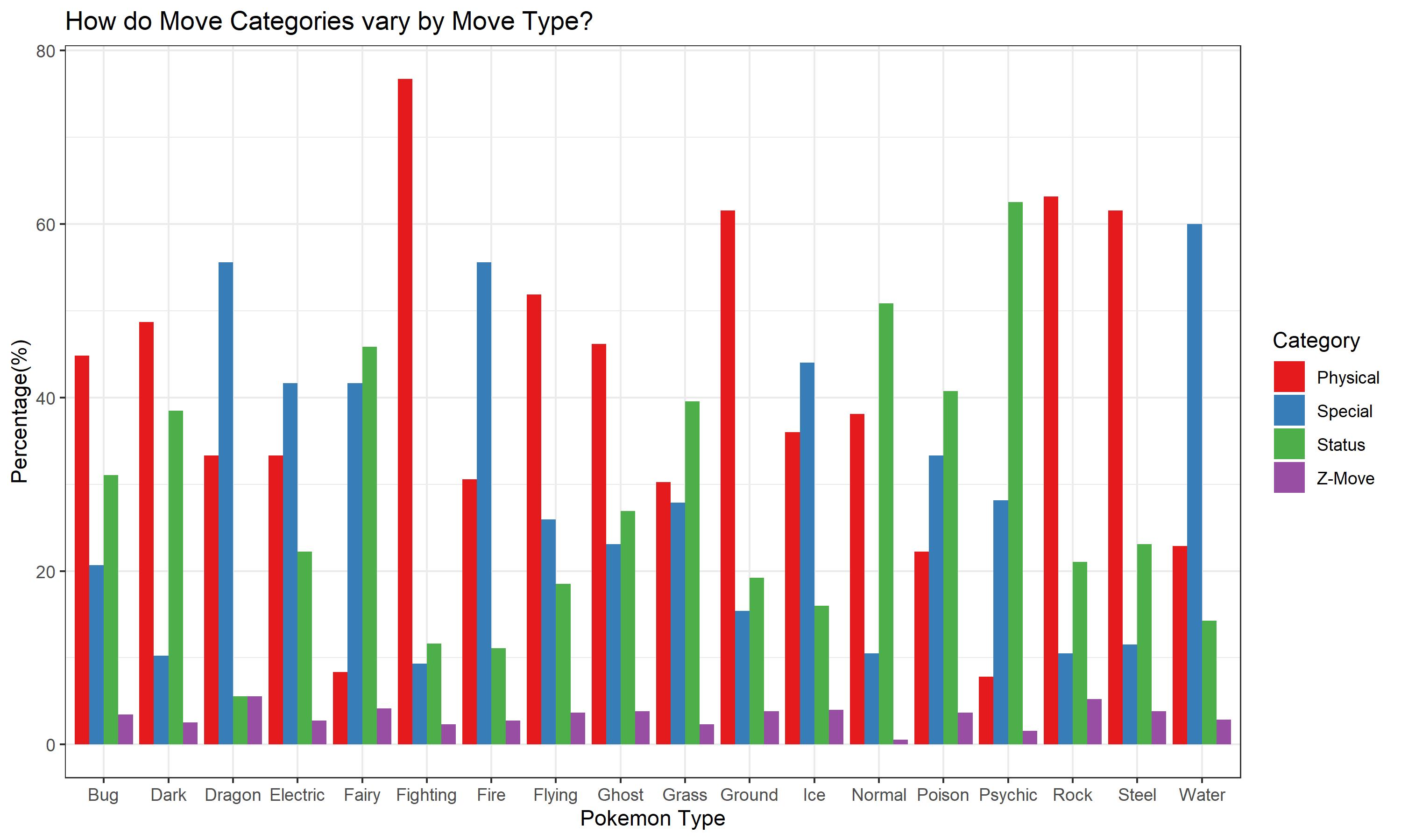
Here we can see some really cool things.
- The most notable thing is that the categories by type are rarely even.
- Majority of the types have the highest percentage in the Physical category
- Dragon and Water have the highest percentage of Special moves, Water containing 60% of its total movepool with the type
- Fighting, not surprisingly has the highest percentage of Physical moves, with more than 75% of its total move pool being that category
- Psychic type moves consist of the largest percentage of Status move category, over 60%
Fighting types having majority physical moves aren’t surprising, but I will say the actual amount is staggering. I was also surprised at the Psychic types having the majority of Status moves, as I assumed it would be Special. Fairy types have an interesting property in being fairly split between Special and Status categories. Finally, I’ve always disliked Ground and Rock types because I felt like they were so similar. It seems as if their movepool also reflects this similarity.
Further Analysis
This is all interesting but we can futher elaborate on things. Let’s ask: Which types have the strongest moves? We can even add Pokémon generations into the analysis in order to add a time-series element into our exploration. For this next portion of the analysis, I decided to remove “Z-moves”. The main reason being is that they are kind of gimmicks of the newest generation. Some Pokémon have personalized Z-moves, but those actually fall under the Status, Physical, and Special categories, so they will stay.
- How are moves added over the generation? By Type and by Category?
In order to do this I am going to need to change my data type in Gen into a factor as opposed to an integer.
All_Moves2 <- All_Moves
# Creating a duplicate object is a bit unnecessary but I am doing it because I am a bit hessetant changes to the original dataset
All_Moves2$Gen <- as.factor(All_Moves2$Gen)
# Now let’s ask: # Question 4: How are moves added over the generation? By Type and by Category?
Q4 <- All_Moves2 %>%
  group_by(Gen) %>%
  count(Type)
Q4
ggplot(data = Q4, aes(x = Gen, y = n, color = Type, group = Type))+
  geom_point()+
  geom_line()+
  scale_color_manual(values = type_col)+
  facet_wrap(Type~.)
Q4graph <- ggplot(data = Q4, aes(x = Gen, y = n, color = Type, group = Type))+
  geom_line()+
  geom_point()+
  facet_wrap(~Type, scales = "free")+
  scale_color_manual(values = type_col)+
  labs(x = "Generation", y = "# of Moves Added", title = "Pokemon Move Types Added Over the Generations")+
  theme_bw()+
  ggsave("MovesAddedByGen.jpeg", width = 8, height = 8)
Q4graph
Which will give me a graph like this:
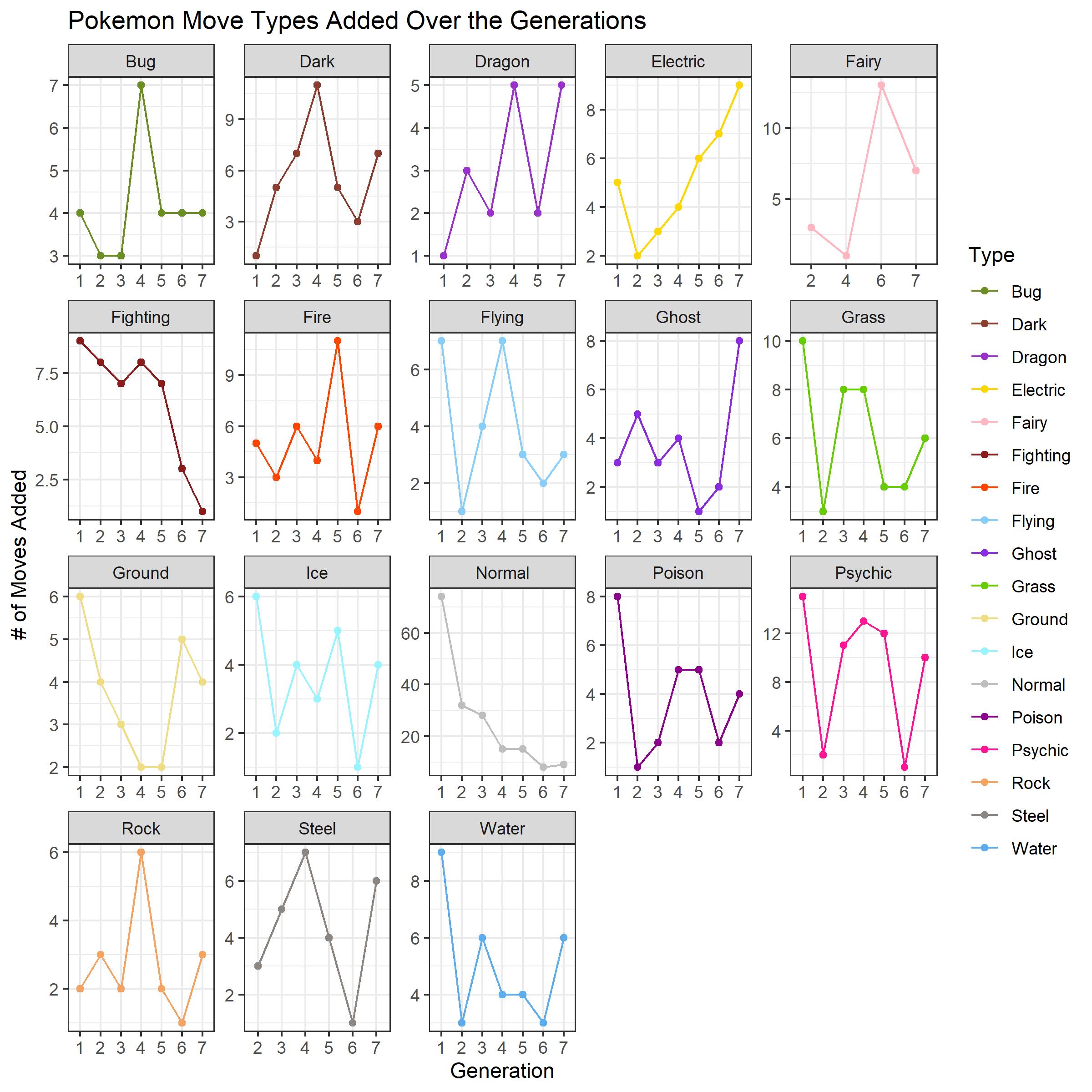 To clarify, we are looking at is how many moves of each type is added each generation.
There are a few interesting things we can derive from the graph.
To clarify, we are looking at is how many moves of each type is added each generation.
There are a few interesting things we can derive from the graph.
- There doesn’t seem to be a particular trend with most move types throughout the generations.
- Electric types have an upward trend throughout the generations
- Normal and Fighting types seem to have a downward trend through the generations
- There seems to be an issue with how fighting types are scaled in this graph. Of course, there is no such thing as a “.5” move added
- Fairy types were introduced in generation 6, however, they have moves added in the second generation forward. This is most likely reporting the moves that were created earlier but changed to Fairy-type retroactively.
This is fine and everything but let’s be honest, whats a Pokémon move without POWER! Power is the real measure of a monster! Let’s start by asking some basic questions! First, I want to see: How the Distribution of Power is effected along a move’s Type and Category For this, I am going to edit things slightly. Looking at our dataset
head(All_Moves2)
Since we want to look at Power, we don’t really care about Status moves. I am also taking out Z-Moves, because again they are just really gimmicks of the latest generation.
Move_Prune <- All_Moves2 %>%
  filter(Category != "Status" & Category != "Z-Move")
Move_Prune
# For whatever reason, we see that Power is a Chr and not a integer/double. LEts fix that
Move_Prune$Power <- as.double(Move_Prune$Power)
# Lets also do the same for Acc and PP
Move_Prune$Acc <- as.double(Move_Prune$Acc)
Move_Prune$PP <- as.double(Move_Prune$PP)
Move_Prune
Now lets see how a move’s typing interacts with its power distribution. I think the best way to visualize this is with a boxplot or violin plot
ggplot(data = Move_Prune, aes(x = Type, y = Power, fill = Type))+
  geom_boxplot()+
  scale_fill_manual(values = type_col)+
  labs(x = "Move Type", y = "Move Power", title = "How Move Power Varies Between Move Type?")+
  theme_bw()+
  ggsave("MovePowerVariation.jpeg", width = 10, height = 8)
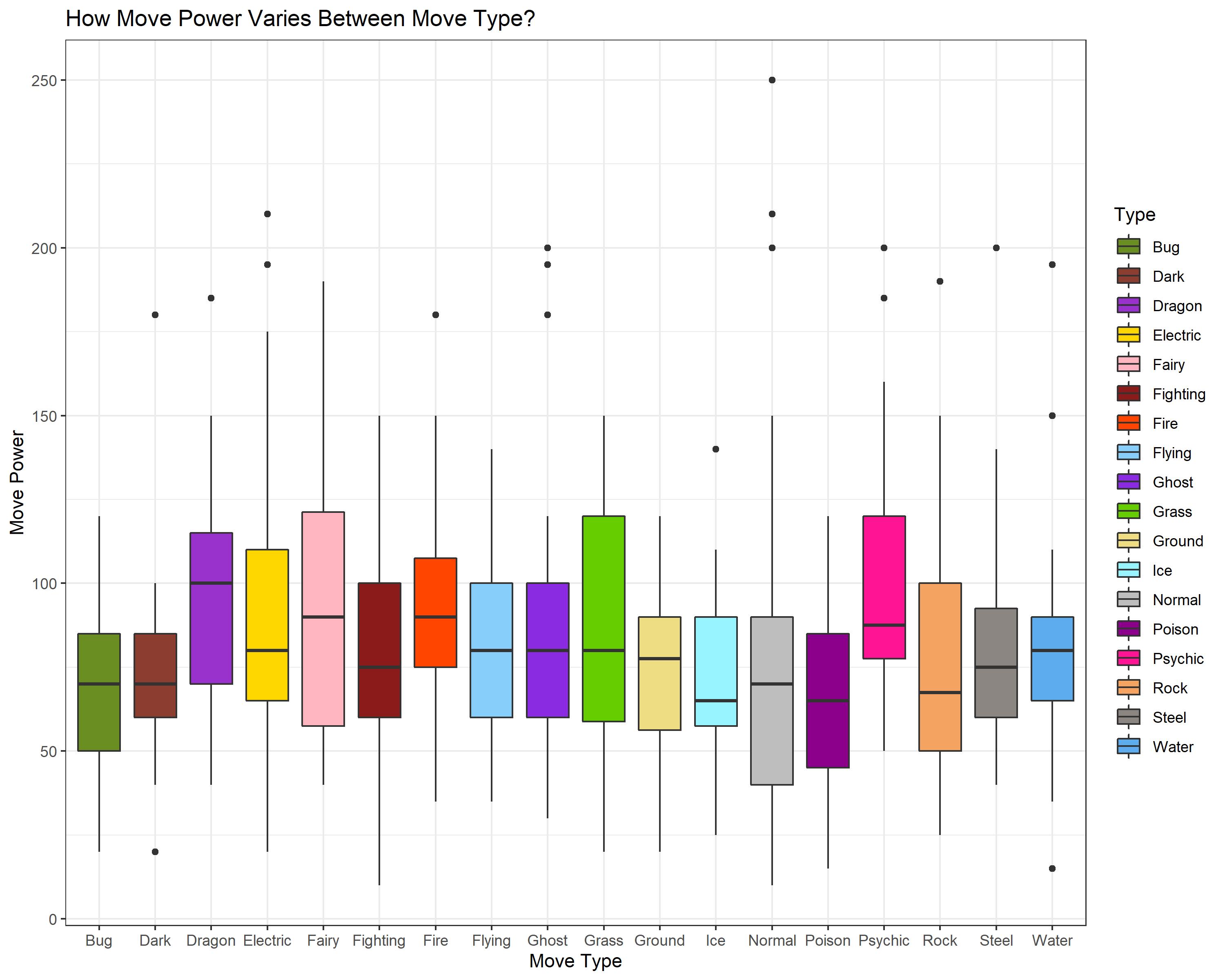
Here can see a few more interesting things here. Namely Fair and Dragon are leading when it comes to Power. Also, poor Bug and oddly enough Dark seem to be behind in power. Finally, I want to say that I am impressed that certain types like Grass, Fairy, and Rock how they have their power distributed more on the higher end. I see Normal types have a very strong outlier move, which I am guessing is “Giga Impact”.
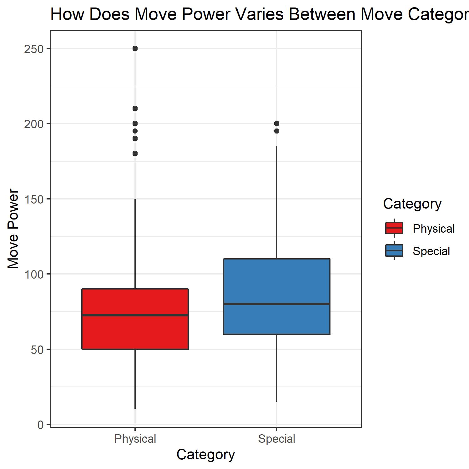
Let’s take a step back and see how the move Category relates to power distribution.
ggplot(data = Move_Prune, aes(x = Category, y = Power, fill = Category))+
  geom_boxplot()+
  scale_fill_brewer(palette = "Set1")+
  labs(x = "Category", y = "Move Power", title = "How Does Move Power Varies Between Move Categories?")+
  theme_bw()+
  ggsave("MovePowerVariationBycat.jpeg", width = 5, height = 5)
So we’ve analyzed the information using Move Type and Move Category. For our final analysis we shall use both!
ggplot(data = Move_Prune, aes(x = Type, y = Power, fill = Type))+
  geom_boxplot()+
  scale_fill_manual(values = type_col)+
  facet_grid(Category ~.)+
  labs(x = "Type", y = "Move Power", title = "Comparing The distribution of Move Power Across Different Move Type by Category?")+
  theme_bw()+
  ggsave("ComparingMovePowerDistribution.jpeg", width = 10, height = 5)
We get something like this:
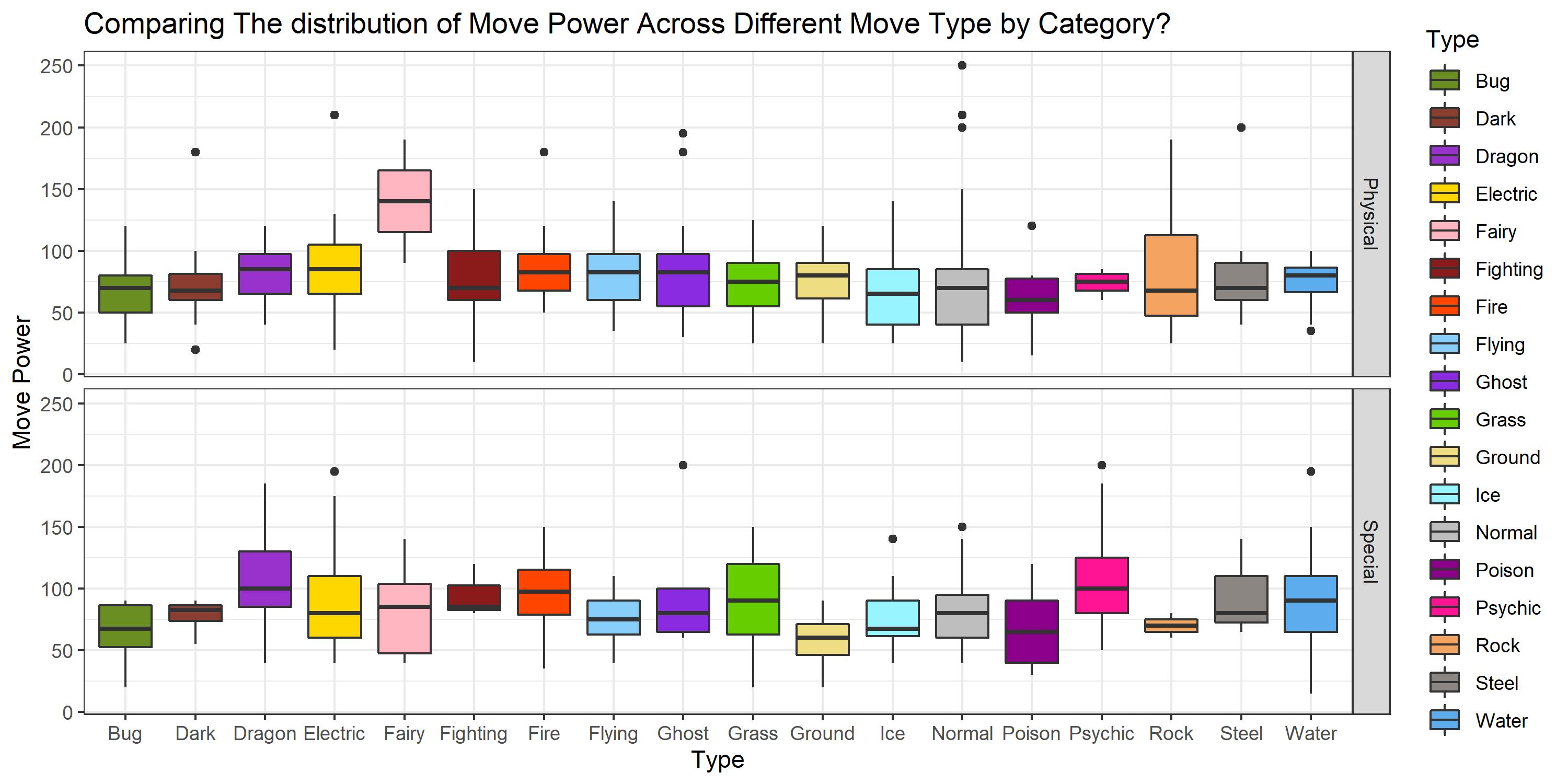
We can see a lot of interesting things here.
- Types like Normal, Ghost, and Electric tend to how extreme outliers no matter which category they are in(I can still see that “Giga Impact” for normal types)
- Fairy type moves generally favor strong Physical moves and Psychic types favor strong Special moves.
- Certain types like Fire-type and Grass-type moves show a fairly normal distribution of move power along both move categories.
Conclusion
Here we see a lot of interesting things when it comes to Pokémon moves. To be honest, when I went about this analysis there really isnt a set conclusion or question answered. I think this is the kind of analysis that has a lot of value when you include other works into it. For example, we looked at the type of moves that were added in each generation. That could be used in conjuction with seeing which type of Pokémon were also added per generation. Maybe there is a correlation?
Our EDA provided proof for some of my more logical predictions, like the Fighting Type having a large number of Physical moves. Sometimes things that I thought I knew about the movepool gave me a surprising amount of evidence. Such as Normal-type moves consisting of 25% of the entire movepool. Remember there are 18 types represented so having just 1 claim that kind of majority is staggering. I hope you enjoyed this EDA and I provided the dataset so you can use this data for your own analysis
Thanks, Pokémaster! For now I am Blasting off Again